Responsive Content – Why It Matters
Look around you right now, and chances are most people are looking at the smartphone screen. Granted, they are likely playing Pokémon Go, but still!
In the US today, 68% of adults own a smartphone and 45% own a tablet device (up from just 3% in 2010)*. Even more interestingly, smartphone ownership is up to 86% in 18-29 year olds.
A content strategy that does not explicitly address mobile devices will have limited success in today’s environment. As a typical user, I have some basic minimum expectations when it comes to digital content:
- Content has to be tailored to my favorite device. Don’t make me switch devices just to access your content
- But if I do choose to continue reading on any of my other devices (I own 3+), I need to do so easily
- I have several potential distractions, so the content needs to be engaging and hold my attention
Designing content and making it responsive from the get go will ensure that you provide a superior user experience to most of your target audience. No more forcing readers to read through a long PDF on the 5 inch smartphone screen, and certainly no more pages with run-over text overlapping images.
What is responsive content? Simply put, content and layout that automatically adjust to the viewing device and user environment. That means video, images, interactivities and text sizes, all appropriately places and sized to give the user the best possible viewing, reading and interactive experience.
Here are some screenshots of the same content that illustrate the concept:
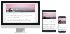 Creating responsive content means adopting a formatting framework (HTML elements and CSS) that dynamically adjust to screen sizes. Most responsive frameworks work on a “grid” system such as Bootstrap. Essentially, the system divides a screen into 12 columns, and media elements (text, video, image) each row in the content total 12 columns across. When this content is viewed on a smaller phone screen (say only 4 columns wide), then the content/media element adapts, and renders accordingly (there is a separate discussion around responsive versus adaptive content, but they broadly tackle the same problem). The picture above is just such an example.
Which brings us to the key question. How much coding help do you need to create responsive content, especially if you are creating training or marketing content? The good news – not much at all! Increasingly, there are powerful authoring platforms that offer readymade templates where your focus can be on creating content, and let the tool show you a preview of how it will look on different screen and devices.
Liked what you read? Send us your feedback or ask for a demo of KITABOO here.
* http://www.pewinternet.org/2015/10/29/technology-device-ownership-2015/
Discover how a mobile-first training platform can help your organization.
KITABOO is a cloud-based platform to create, deliver & track mobile-first interactive training content.