Best Fonts for eBooks (2026): Quick Picks
Summarize this blog with your favorite AI:
Best Fonts for eBooks (2026): Quick Picks – TL;DR
Good eBook typography shapes how your readers feel on every device. The right fonts improve clarity, reduce strain, and support smooth reading across Kindle, Kobo, and Apple Books. Strong spacing, contrast, and layout choices matter as much as the fonts themselves.
EPUB rules, accessibility guidelines, and device behavior all influence how text appears. Embedding fonts, testing devices, and using structured spacing help your book stay consistent. KITABOO makes this work easier with clean tools for creation, layout, and distribution.
Here’s a quick snapshot:
| Topic | Key Insight |
|---|---|
| What an eBook font is | Fonts behave differently on eReaders and apps, but defaults still matter. |
| Why readability matters | Good x-height, open shapes, and strong spacing support clear reading. |
| Device behavior | Kindle, Kobo, and Apple Books handle fonts with unique controls. |
| Accessibility research | Studies show mixed results, but spacing and contrast help most. |
| EPUB embedding | Use @font-face and OPF updates when custom fonts are needed. |
| Typography steps | Choose stable fonts, set clear spacing, and test across devices. |
| Final checks | Review structure, glyphs, packaging, and rendering on all screens. |
| Why KITABOO helps | It simplifies layout, testing, and secure eBook delivery. |
Many readers open an eBook and feel something is not quite right. You may have felt the same when the text looked cramped or tiring. These moments remind you how much the reading experience depends on simple choices. One of the most important choices is the font on the screen. This is where the search for the best fonts for eBooks begins.
You want your readers to feel calm and focused from the first page. You want text that feels smooth on every device. You want a layout that supports long reading without strain. The right font helps you deliver this kind of experience.
What is an eBook Font?
An eBook font is the typeface your reader sees when they open your book. Its meaning changes slightly across devices because eReaders and apps treat fonts differently. Many eReaders load built-in fonts and let users switch them easily.
Apps often use system fonts and offer similar controls for size and weight. This means the font you choose is only the starting point for the reading experience.
Readers can change fonts at any moment, but your default still guides their first impression. A good default supports clear spacing and smooth reflow across screens. It also follows basic standards that help every device render text well.
These small choices shape how relaxed and focused your reader feels. This is why smart font selection still matters even with user controls.
What Makes a Font Good for eBook Reading?
A good font helps readers feel calm and comfortable through long sessions. It reduces strain and keeps every line clear across devices. These traits matter because eBooks reflow on many screens and need stable, readable shapes.
1. Legibility Traits
A good font has a large x-height to improve clarity at small sizes. Open apertures help readers tell similar letters apart. Clear glyph shapes prevent confusion in fast reading.
Consistent strokes keep each letter balanced on eInk and LCD screens. Modest contrast supports smooth rendering on low-resolution displays.
2. Page Styling and Layout
Font choice works best when paired with strong page styling. A line length between 45 and 90 characters improves focus for most readers.
A target of around 66 characters supports long and steady reading. A line height of at least 1.4 or 1.6 creates enough breathing space. Generous margins help the page feel open and calm.
3. Contrast
Good contrast makes text easier to read on bright or dim screens. Aim for a ratio of at least 7:1 for normal text.
A ratio of 4.5:1 is suitable for large text. Strong contrast helps older readers or low vision users. It also supports comfortable reading on phones in outdoor settings.
What Does Research Say About Accessibility and Special Fonts?
When you study the best fonts for eBooks, you will see many claims about reading performance. Some claims focus on dyslexia, and others focus on low vision.
Research shows that font design helps, but layout and spacing often matter more. These findings help you choose fonts that support real reader comfort.
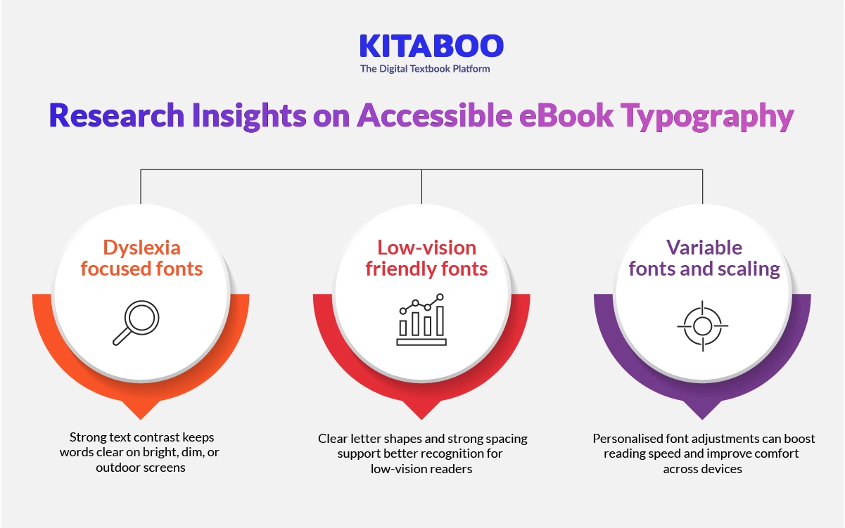
1. Dyslexia-focused Fonts
Research shows no clear objective gain for dyslexia fonts like OpenDyslexic. A controlled study of readers with Dyslexia found no improvement in reading speed or accuracy.
Many users still report subjective comfort with these fonts. This comfort varies across reading styles and devices. The safest choice is to offer them as optional settings that complement the best font for an eBook.
2. Low-vision Friendly Fonts
Research shows that letterform clarity helps users with low vision. Atkinson Hyperlegible improves recognition through distinct shapes, which supports faster visual processing.
Studies also show that spacing, contrast, and other variables improve reading more than shape alone. These traits help readers stay comfortable with the best fonts for reading.
3. Variable Fonts and User Scaling
Research shows strong benefits for personalised adjustments. A recent study found that custom font settings increased reading speed by about 35%.
Variable fonts support these adjustments with flexible width and weight settings. This flexibility helps users match text to personal comfort levels. It supports a wider range of readers using the best eReader fonts.
How Can You Embed Fonts Safely in EPUB Files?
Font embedding in EPUB controls how your book appears on every device. It helps you maintain stable rendering across platforms with different font rules. It also becomes essential when you choose the best fonts for eBooks because each system handles fonts differently.
1. EPUB 3.3 Font Support
EPUB 3.3 allows creators to embed customizable fonts inside the file package. This ensures consistent rendering even when users change settings. It also protects layouts that rely on precise shaping for special eBook fonts.
Always check the license before embedding any typeface. Licensed fonts often need special permissions for digital distribution. Proper licensing keeps your workflow safe and compliant.
2. Using @font-face in EPUB
You can include fonts using the @font-face rule inside your CSS. Store your font files inside the OEBPS/fonts/ folder to stay organised. Call the font using a simple @font-face declaration in your stylesheet.
Update the content.opf file so reading systems load each font correctly. Test your EPUB after embedding to confirm smooth rendering. The best EPUB readers ensure predictable results with the best fonts for eBooks.
3. When to Avoid Embedding
Avoid embedding a font when the reading system already includes that exact typeface. This reduces file size and improves performance across devices. Skip embedding heavy families that slow page loads or increase package weight.
Embed only when your design needs non-Latin scripts or brand typefaces. These cases benefit from custom files that maintain identity. This protects consistency and maintains the best eBook font experience for all readers.
How to Guide:
How to Transform Print Titles into Interactive eBooks
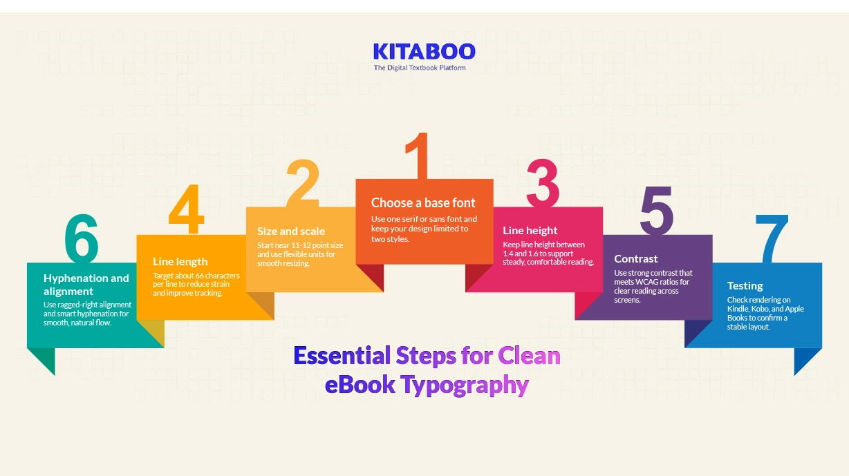
How Can You Optimise eBook Typography Step by Step?
Strong typography helps your content feel clear and comfortable across screens. These steps guide you through simple choices that support stable reading. They also help you get the most from the best fonts for eBooks because layout matters as much as font design.
1. Choose a Base Font
Pick a serif font for long-form reading or literature. Choose a modern sans font for manuals or edtech content. Limit your design to two fonts for a clean structure. Use one for headings and one for body text. This balance supports clarity with the best font for an eBook.
2. Size and Scale
Start around an 11 to 12 point equivalent on eInk screens. Increase the size slightly on phones for better clarity. Use relative units so readers can adjust easily. This helps screens reflow cleanly during resizing. It also keeps your layout stable across many devices.
3. Line Height
Use a line height between 1.4 and 1.6 for comfort. This spacing helps each line breathe and stay readable. Increase spacing slightly for dense text blocks. Keep paragraphs at least 1.6 to 2.0 times the font size. This maintains rhythm across long sections.
4. Line Length
Aim for about 66 characters per line on average. Shorter lines reduce eye strain during long sessions. Longer lines make tracking harder on small screens. Keep your margins flexible so text reflows well. This improves comfort with the best fonts for eBooks.
5. Contrast
Match your text and background to WCAG contrast guidelines. Aim for a strong contrast in bright or dim settings. Avoid thin weights on grey backgrounds. Check your design on eInk and LCD devices. Good contrast supports smoother reading with the best fonts for reading.
6. Hyphenation and Justification
Use ragged-right alignment for natural flow. Enable smart hyphenation to reduce awkward breaks. Avoid tight tracking because it hurts legibility. Keep spacing loose enough for fast scanning. This supports clarity across formats and screen sizes.
7. Testing
Test your file on Kindle, Kobo, and Apple Books. Check reflow, ligatures, and kerning on each device. Review how emojis and non-Latin glyphs render. Confirm that spacing and alignment remain stable. This ensures the best eBook font performs well everywhere.
Final Checks Before You Publish
Before you publish your eBook, a careful review helps you catch hidden issues. This step confirms that your structure, spacing, and font choices feel consistent across screens. It also ensures that symbols, accents, and non-Latin characters render cleanly on all devices.
A final check protects your layout from small errors that disrupt reading flow. It helps every chapter feel smooth, stable, and ready for your audience.
You should open your file on different apps and eReaders to see real behavior. Check how your chosen fonts respond to user settings like size and weight. Review images, tables, and links to ensure nothing breaks during reflow.
Confirm that margins, headings, and line spacing stay steady across platforms. This last step helps your eBook feel polished and professional before you publish.
Conclusion
Great typography helps your eBook feel clear, inviting, and easy to read. The right font choices support comfort on every screen and help your content shine. Readers stay engaged longer when the page feels smooth and readable. These choices matter even more as devices and formats keep changing.
KITABOO helps you bring these choices together with ease. You can create clean pages, manage fonts, and refine spacing without technical effort.
Every eBook feels consistent across devices because KITABOO handles rendering with care. This gives you a simple way to publish typography that feels professional and ready for any reader. Ready to create high-quality eBooks with strong typography? Book a KITABOO demo today.
FAQs
Most eReaders use built-in fonts like Bookerly, Literata, Caecilia, or Noto.
Serif fonts like Georgia or Literata work well for long-form reading.
Bookerly, Georgia, and Noto Serif are popular for clear, steady reading.
Bookerly suits Kindle well, while Kobo users often prefer Literata or Noto Serif.
Serif works well for long reading, while sans serif suits manuals and short content.
Studies show no clear speed or accuracy gain, but some readers prefer them.
Yes, when you need custom or non-Latin fonts, but not when readers supply them.
Start around 11–12 point equivalent with line height between 1.4 and 1.6.
Discover how a mobile-first training platform can help your organization.
KITABOO is a cloud-based platform to create, deliver & track mobile-first interactive training content.


