The Top Data Visualization Tools for Analyzing Complex Data
Summarize this blog with your favorite AI:
The education industry is evolving rapidly under the influence of digitalization. With the emergence of eLearning, expected to be valued at $1 trillion by 2032, and digital learning platforms like KITABOO, the ways of imparting education are changing.
Additionally, ways of storing academic information are also becoming digital.
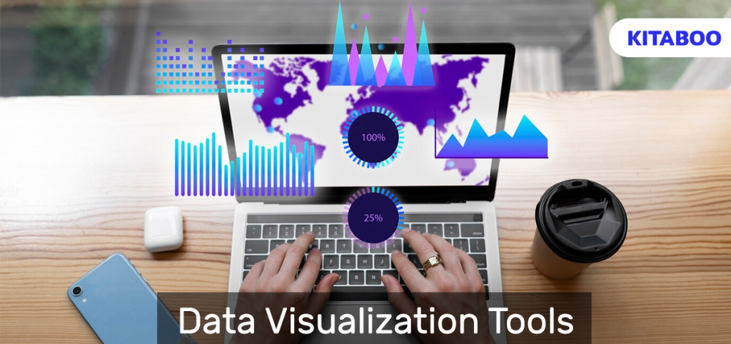
As a result, there is a growing need for tools and software that can effectively organize and analyze complex data. This need has increased the demand for data visualization tools, which present data in the form of graphs, charts, maps, infographics, and plots.
In this blog, we will delve into the list of top data visualization tools that can help educators and publishers understand and communicate complex information effectively.
Table of Contents:
I. Top Data Visualization Tools in 2023
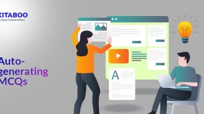
- KITABOO’s Learning Analytics Dashboard
- Tableau
- Zoho Analytics
- Looker
- Qlik Sense
- Sisense
- Microsoft Power BI
- Domo
- Klipfolio
II. The End Note
Top Data Visualization Tools in 2023
Data visualization tools help to represent data in a variety of subjects, including Statistics, Science, and Math, along with information about students’ academic progress easily.
The top data visualization tools instrumental for academic educators and publishers are as follows:
KITABOO's Learning Analytics Dashboard
With KITABOO’s Learning Analytics Dashboard, you can represent complex educational data in the form of easy-to-understand tables, graphs, charts, and other visual elements.
You can also use KITABOO’s Learning Analytics Dashboard to teach students the representation of data in visual formats. This practice will help students interact and engage with data, enhancing their ability to comprehend and convey complex information effectively.
Apart from this, KITABOO’s Learning Analytics Dashboard allows you to identify key performance indicators related to students’ achievement, engagement, and behavior. With the power of predictive analytics, the dashboard enables you to predict students’ future performance.
Additionally, the dashboard also enables you to generate data-driven reports about students’ academic progress regularly.

Tableau
As a popular data visualization tool, Tableau is easy to use and allows you to create different types of charts, graphs, and maps.
You can connect it to a variety of data sources and develop visualizations of all kinds with drag-and-drop. In addition, you can leverage the power of AI to build AI-powered statistical models and diagrams.
Tableau comes equipped with state-of-the-art security, enabling you to develop and share insights about academic progress with students, free from the worry of security breaches.
Zoho Analytics
With Zoho Analytics, you can visualize and explore a comprehensive amount of data quickly. You can also import and merge data from a number of data sources to create multidimensional data visualizations with a simple drag-and-drop interface.
For instance, you can create analytical reports about students’ performance on a couple of tests and share them with students. You can also, as a publisher, publish analytical reports about the changing dynamics and trends in the education industry.
Looker
As one of the top data visualization tools, Looker studies data in depth before representing it through visual elements. Looker allows you to choose from a set of visualization options, such as master plots, bar gauges, heat maps, and more.
Looker also offers pre-made analytical blocks containing templates for data analysis. In addition, Looker allows you to share and export data-driven analytical reports with others in a file format of your preference.
Qlik Sense
As an offering of the Qlik Active Intelligence Platform, Qlik Sense uses AI to help educators analyze and understand complex data quickly.
Qlik Sense provides a deeper level of interactivity than other data visualization tools. It also provides faster computations, greater context, and the capacity to link and merge data from hundreds of data sources.
With just drag-and-drop, Qlik Sense allows you to create analytics and generate valuable insights, which you can share with your students.
Sisense
As an intelligent analytical system, Sisense allows you to gather data in one place by linking multiple sources of data together. Sisense also allows you to analyze data and present the analysis through dashboards, charts, and graphs.
In addition, Sisense empowers you to identify key data patterns and generate analytical reports without the need to be technically proficient. Furthermore, Sisense also provides round-the-clock customer support to resolve any issues that you might end up encountering.
Microsoft Power BI
Microsoft Power BI is a versatile data visualization tool that provides a broad range of visualization options, from basic graphs to advanced charts.
Power BI enables the collaboration of data from various sources and provides real-time data analytics. It also enables you to track learning goals and make data-driven curriculum changes.
Apart from this, Power BI offers stringent security features to protect students’ data from unauthorized sources. Besides this, it allows for integration with other Microsoft tools and software.
Domo
Domo provides multiple data visualization options that you can use to analyze data and create custom visual representations of data. With an easy-to-use interface, Domo helps you narrate a data-driven story.
Domo also allows you to control and restrict access to the story to selected people, preventing data breaches. In addition, Domo helps you share the data-driven story in the form of an analytical report in a number of formats.
Klipfolio
As one of the top data visualization tools, Klipfolio allows you to use pre-built, curated metrics to access and aggregate data from hundreds of sources—all without writing code.
You can edit and analyze data to gain in-depth understanding and insights. You can further utilize Klipfolio’s robust data modeler to inform academic curriculum and pedagogy-related decisions.
In case you get stuck or have a query, you can reach out for assistance to Klipfolio’s community and knowledge forums.
The End Note
Data visualization tools carry multiple benefits for educators and publishers alike. They make it easy to:
- Represent complex educational data visually
- Discover hidden patterns and relationships
- Identify key performance indicators
- Predict future learning outcomes
- Publish insightful reports about educational trends
With the data visualization market expected to grow to $19.5 billion by 2031, it is in the best interest of academic institutions and publishers to invest in data visualization tools.
To start with, academic institutions and publishers can consider investing in KITABOO’s Learning Analytics Dashboard. The easy-to-use dashboard provides a plethora of data visualization options that are mobile-friendly, highly secure, and scalable.
Apart from this, the dashboard provides AI-powered, data-driven insights and also allows for seamless integration with multiple tools and platforms.
To know more, write to us at contact@kitaboo.com.
Suggested Reads:
- Leveraging Digital Publishing Platforms with DRM for Secure Content Distribution
- HOW TO GUIDE: How to Create an Online Training Program for Employees
- What are the latest eLearning content creation tools?
- WHITEPAPER: The State of Digital Content in Global K12 Education
- Corporate Training Apps: Improving Employee Productivity
Discover how a mobile-first training platform can help your organization.
KITABOO is a cloud-based platform to create, deliver & track mobile-first interactive training content.